
The Drop Box
There is a wooden box in the lobby of my church. Next to it sit a stack of index cards and a pen. If you want the prayer team to pray for you, you write your request on a card and drop it in.
The prayer team meets every week, and at one of those meetings they shared something that stuck with me: they do not get many requests. Not because nobody needs prayer. Every congregation is full of people carrying heavy things. It is because the intake system is a box you have to walk up to, in public, on a Sunday, with a card in your hand.
The distance between "I need prayer" and "someone is praying for me" was a piece of furniture. I wanted to close that distance.
Why I Built This
I have personally experienced the power of prayer: the encouragement, through genuinely difficult seasons, of knowing that a friend or even a stranger was praying for me and my family. That experience is the entire reason this project exists. This was never really a software project. It is a connection project, and the software is just the bridge.
So the goal was never "build a prayer platform." It was: remove the barrier between the congregation and the prayer team, make it easy for people to send requests and easy for the team to receive them, and help the team feel encouraged rather than burdened by the work they are doing.
Principles Before Pixels
Before I built anything, I wrote down a few convictions. They ended up making most of the product decisions for me.
Anonymity built in, not bolted on. People share their heaviest things when they ask for prayer. So a requester's phone number is hidden at the deepest layer of the system, where even the prayer team cannot reach it. Replies flow through the app, which means a team member can text someone a personal word of encouragement without ever seeing who they are.
Deliberately few features. Every feature I did not build was a decision. No comment threads, no categories, no requester profiles, no feeds. I did not want a bloated tool that needed maintaining. I wanted something a volunteer prayer team would actually open.
Encouragement, not metrics. Dashboards drift toward becoming task lists. I wanted the team's overview to feel like a testimony, not a backlog.
Meet people where they are at. Some people will use a web form. Many more will send a text message. The app treats both as front doors of equal standing.
What Took Shape
The skeleton came together fast, in March: a public request form, a place for the team to sign in, and a phone number the congregation could text. Two doors, one queue. Then the project sat quietly for a few months, which turned out to be useful. When I came back to it in July, I could see clearly which ideas had survived the wait and which had not.
The congregation still sees exactly two things. A quiet, calming web page where anyone can share a request, name optional, phone optional. And a phone number they can simply text. Either way, the request lands in the same place.
That web page is below. Not a screenshot of it, the actual thing: this form is live, and if you share a request here, a real prayer team in Seattle will really pray for you.
We’re here with you
Prayer Requests
Share what’s on your heart and our team will pray for you.
The prayer team gets a simple dashboard: a feed of requests and one button that matters, Pray. For requests that came in by text there is a second button, Respond, which sends a personal reply back as a text message without ever revealing the requester's number. Team members sign in with a password or a link emailed to them, and an admin can invite new members by email.
Here is the team's side, rebuilt as a demo with made up requests so you can press everything:
My mom is having surgery on Friday. Please pray for steady hands for the surgeon and a calm heart for all of us.
Starting a new job on Monday after a hard year. Praying it is a good beginning.
Around that core, a care loop grew one piece at a time:
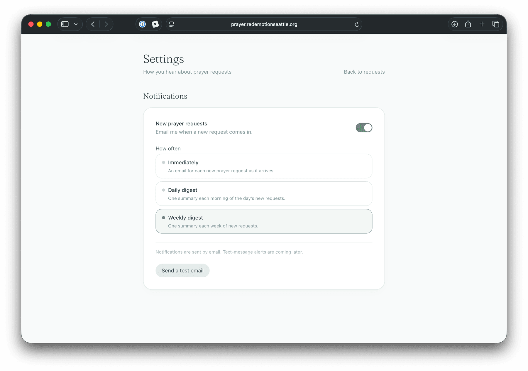
- Team notifications. Each team member chooses how they want to hear about new requests: immediately, as a daily digest, or as a weekly digest. I moved the weekly one to Saturday morning specifically so it lands fresh before Sunday.
- "Someone prayed for you." If a requester says yes to updates, they get at most one text a day letting them know someone prayed for them.
- Encouraging stats. An overview for the team that celebrates what was done instead of tallying what is owed. More on that below, because it took a wrong draft to get there.
Under the hood it is Next.js on Vercel, Supabase for the database and sign in, Twilio for text messages, and Resend for email, with scheduled jobs sending the digests and the daily texts. I kept the stack boring on purpose. Boring is exactly what you want underneath something a church will depend on.
Scenes From the Build
The afternoon the dashboard read zero. Months in, I opened the admin overview and every stat tile said zero, sitting on top of real data. My first instinct was that something had broken. Something was actually working. Because phone numbers are hidden at the deepest layer of the system, any query that asks for everything gets refused, and my own stats counters were asking for everything. The privacy design was defending the data against my own dashboard. The fix was to count only what we are allowed to see. I have never been happier to be locked out of my own product.
Eight drafts of two sentences. My favorite session of the whole project involved no code at all. When someone gets a text saying they were prayed for, what should it say? We went through eight drafts chasing a voice I could only describe as your empathetic and honorable best friend texting you. The winner: "Someone prayed for you today. Grace and peace to you." The closing line is kept verbatim from Scripture. There is a quiet system behind the wording too, and you can play with it here:
Redemption Prayer
Today 7:12 PM
Press Pray and watch the wording: one is “someone,” two is “a couple people,” and only at three does a number appear.
Compliance as care. Sending texts to congregants means carrier regulations: registered campaigns, consent language, STOP and HELP keywords. Instead of treating that as legal boilerplate, I folded it into the product's ethic. There is even a REMOVE keyword that deletes a requester's data entirely, so the privacy policy's promise is backed by actual code. And the required identification rides only on the first "someone prayed for you" text. Every one after that just reads like care.
Metrics that encourage. The first stats row I sketched had "Active requests" front and center. Then I sat with it and realized it was emotionally backwards. An open queue counter climbs when the team is behind and reads zero when things are calm. A chore chart. So the overview got reframed around work that was done rather than work that is owed: requests received, prayers offered, replies sent, over the last 30 days, with a quiet "to date" line underneath for the lifetime picture. No leaderboards, no per member counts. Prayer is not a competition, and a ministry dashboard should not accidentally suggest otherwise.
The last 30 days
0
Requests
0
Prayers
0
Replies
To date: 21 prayer requests · 68 people prayed for · 15 replies sent
Designing for Calm
The visual language borrows from a spa more than from software: a sage and mist palette, a warm serif for headings, soft cards, slow gentle animations. Even the empty state says "All is quiet" instead of "No results found." You may have already met it if you archived both requests in the dashboard demo above. Someone opening this app is often about to read another person's hardest week. The interface should lower their heart rate, not raise it.
Building It With AI
I built this by pairing with Claude Code, and it changed the shape of what one person can ship. The AI read production logs to figure out why invite links were broken, ran the checks that uncovered the church's domain limitation, traced the password manager popup to its root cause, and turned planning conversations into working features: database changes, scheduled jobs, entire settings pages.
But the division of labor matters. The AI never decided why. The drop box observation, the conviction that metrics should encourage rather than gamify, the insistence that a text should sound like a friend, the choice to keep "Grace and peace to you" word for word. That direction stayed human. The sessions I remember best are the ones that looked least like programming: workshopping a two sentence text message until one version felt like something you would actually want to receive. AI compressed the distance between intention and working software. The intention was still the point.
Where It Stands
The app is live at prayer.redemptionseattle.org. The prayer team is being onboarded now, and the first real requests are replacing the test data. It is early. The numbers on the dashboard are small, and that is fine. The drop box never counted anything at all.
Next, maybe: an installable home screen app with push notifications, gentle follow ups ("still praying for you, any update?"), and a place for answered prayers, because the team should get to see how the story ends.
What I keep coming back to is that the entire project is a wager on one idea: that there are more people who want to pray, and more people who need prayer, than any drop box will ever reveal, and that a well placed piece of software can introduce them to each other.
Grace and peace to you.